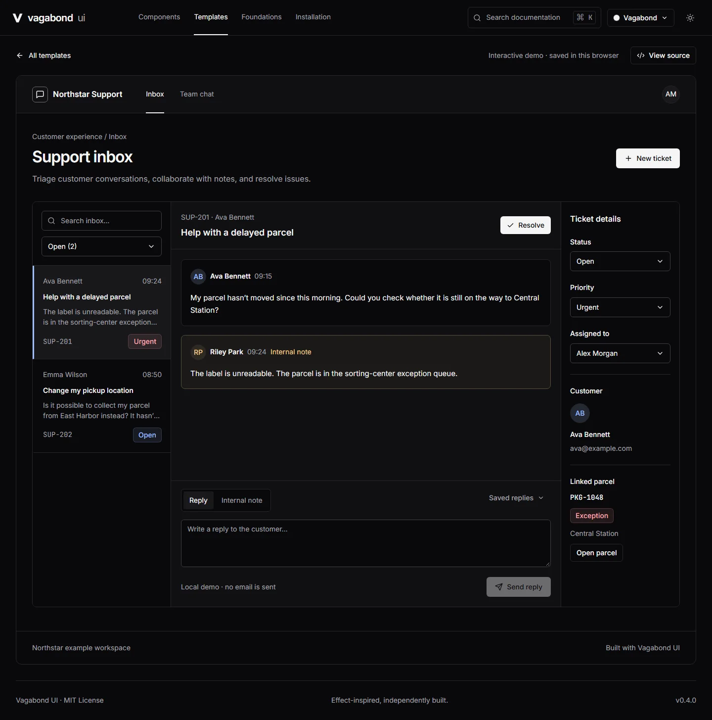
A reusable interface foundation
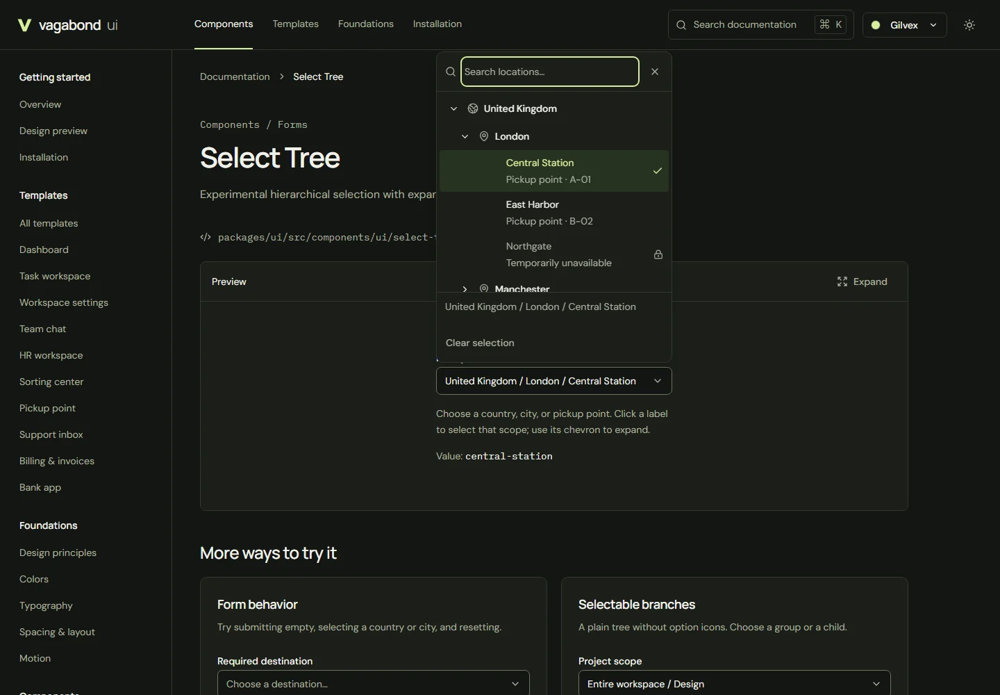
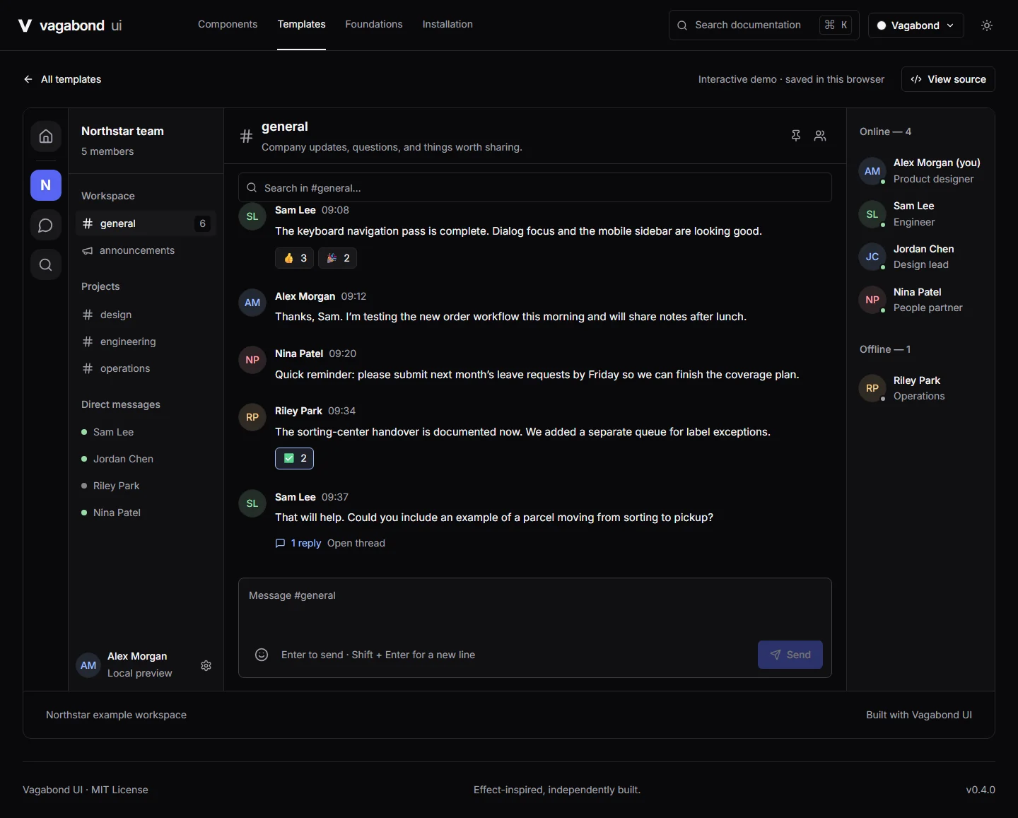
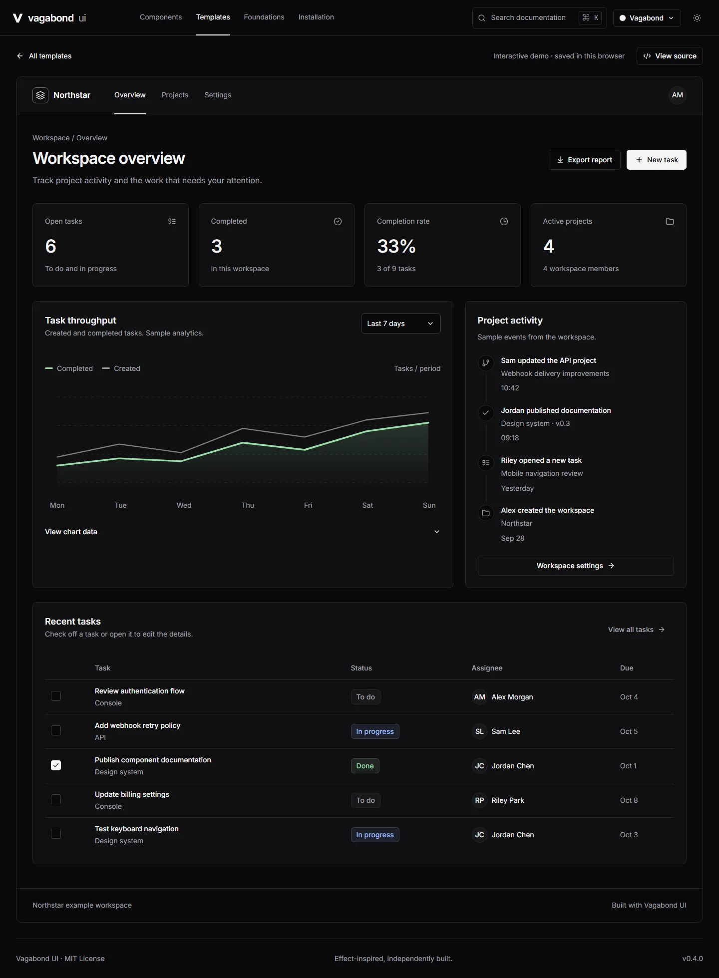
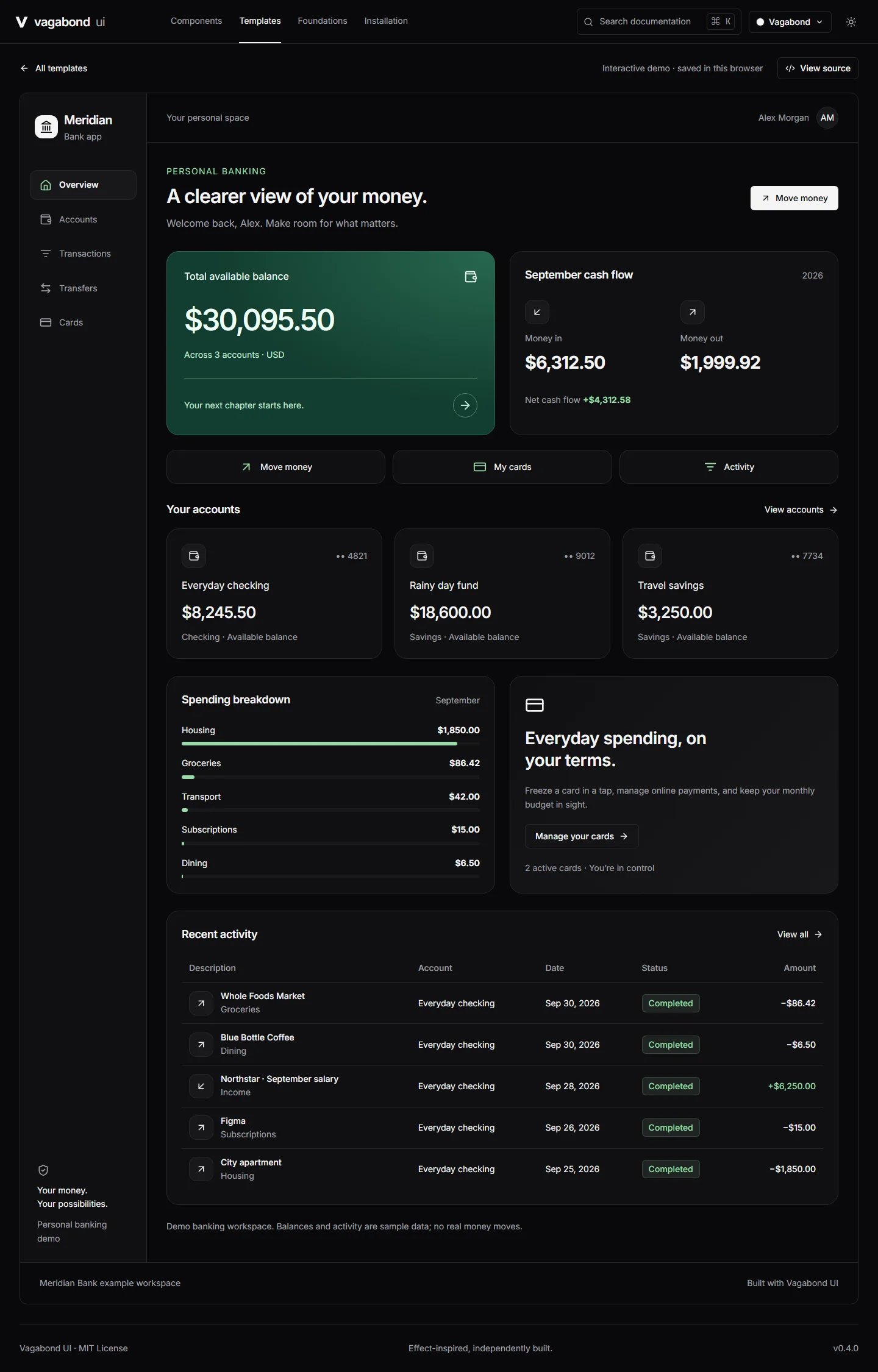
Vagabond UI is a React 19 and TypeScript component library built with Radix UI and Tailwind CSS. It includes 38 component families and supports light and dark themes.
Interaction as part of the component
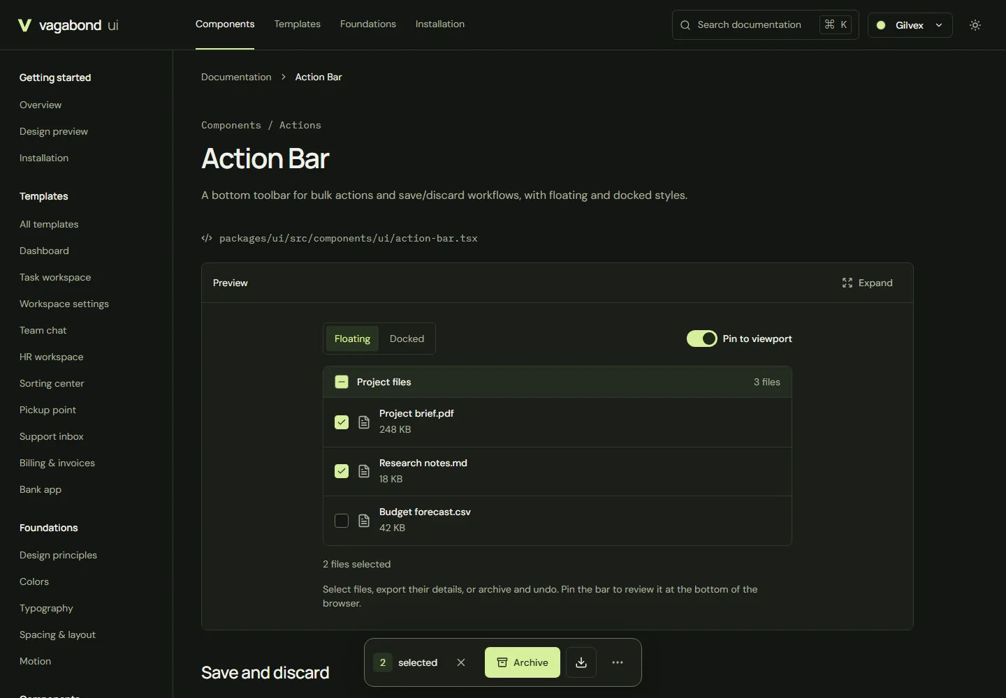
The Action Bar work includes keyboard behavior, focus management, and reduced-motion support. Those interaction details sit alongside the visual design of the library.
Beyond the source repository
Typed exports, consumer installation checks, and browser tests cover how the library is used as a package. Both the source repository and published npm package are linked above.